Designing With Purpose:
The Orenna Web Experience
Good UX isn't accidental — it's the result of someone who notices when things don't work and won't stop until they do. That's how I approach every project, and Orenna was no exception.
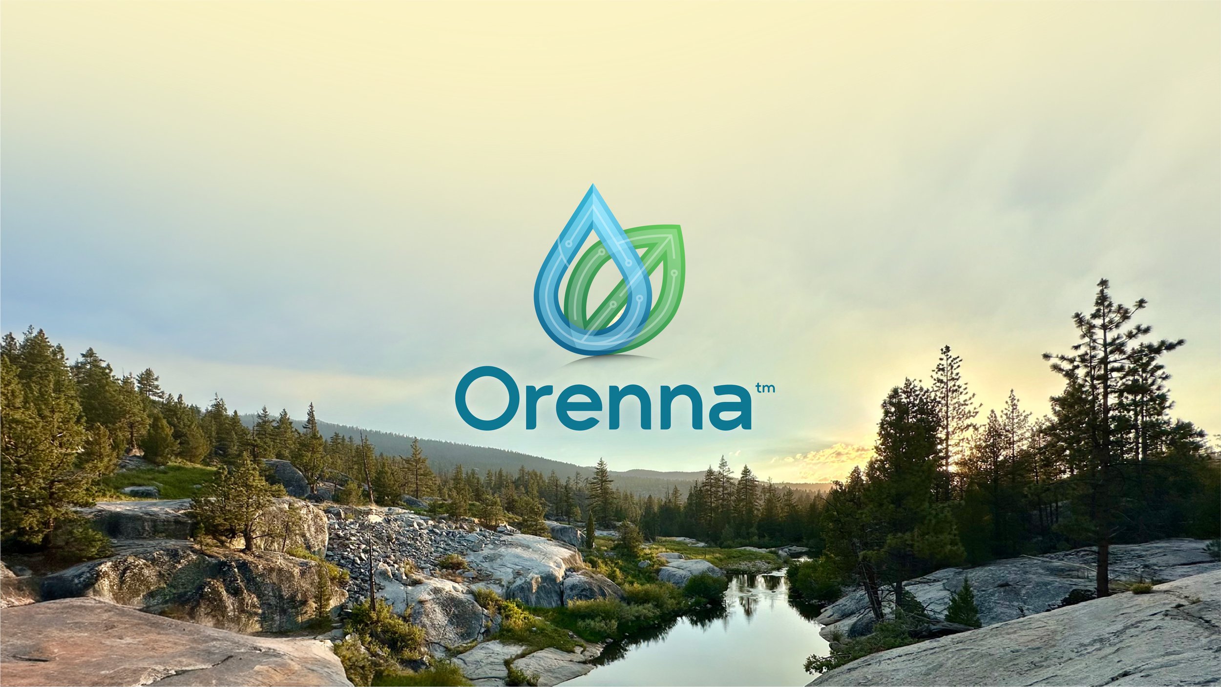
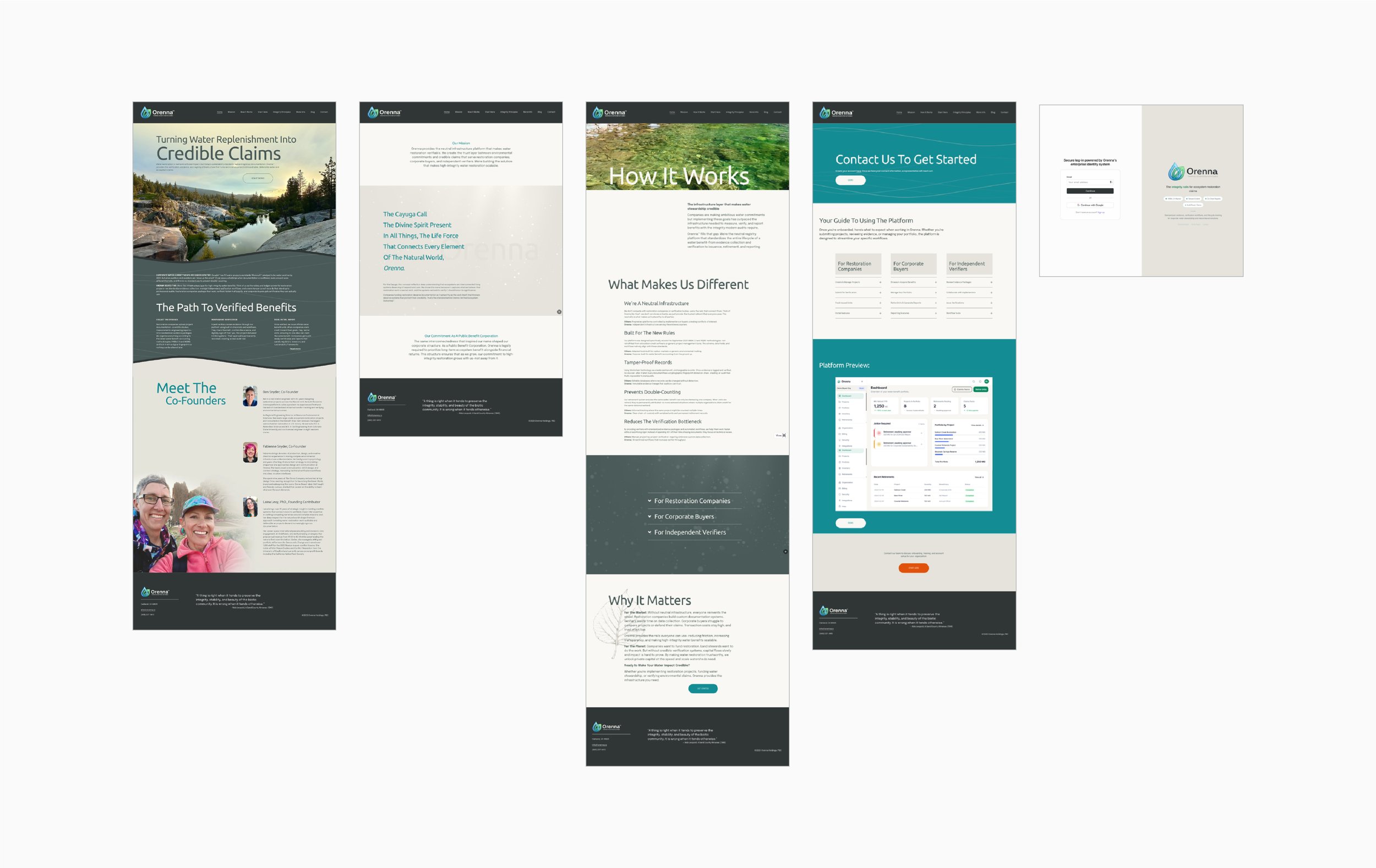
Orenna is a water restoration verification and registry platform built for enterprise clients. From the beginning, the design challenge was clear: create a digital experience that felt credible, modern, and purposeful — one that could speak to sophisticated users without losing the humanity at the heart of what water restoration means.
The design evolved through multiple phases, moving from a warmer, more approachable aesthetic toward a cleaner, more refined enterprise sensibility as the product vision sharpened. I refined the color palette repeatedly, lightening the backgrounds to bring clarity and sophistication. A subtle wave animation — drawn from the site's water theme — was woven through several pages as a background element, present enough to feel intentional, understated enough to never compete with the content.
Each page was treated individually based on its function. Accordion text blocks helped tame content-heavy pages, keeping them navigable without sacrificing depth. Every interaction point was questioned: what would someone expect here? What's the most natural next step?
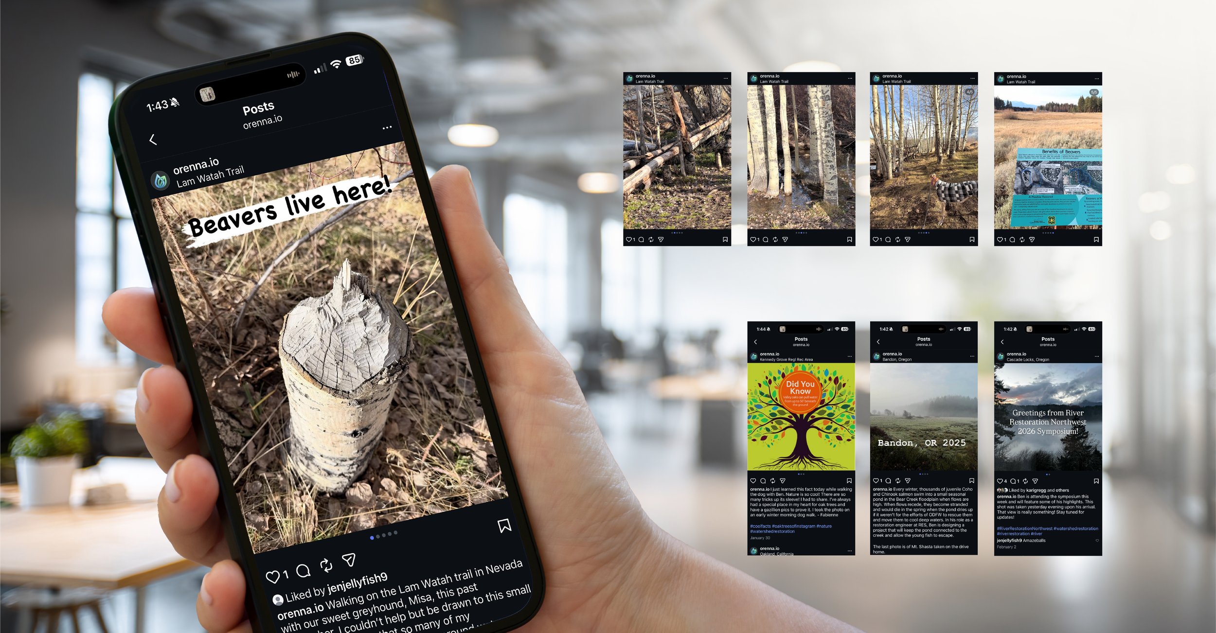
All photography on the site is my own — shot on location across the natural landscapes that inspired the platform itself. Having a personal library of high-quality nature photography meant the imagery could be as considered and authentic as the design.
I was shaped early in my career by a mentor who had zero tolerance for the 70% solution — the design that almost works, the object that almost makes sense. That instinct is hardwired into how I work. Whether it's a website, a package, or deciding where the kitchen towel hook goes, everything has a right place. I design until I find it.
Logo Exploration Using AI & Traditional Method
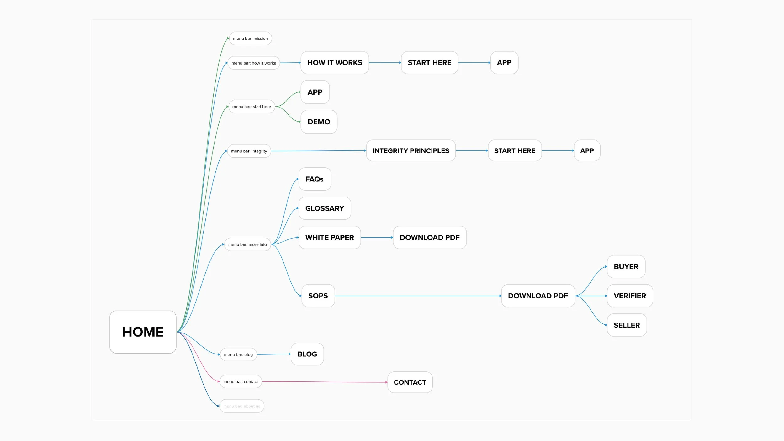
Site Architecture
UX Design Iterations
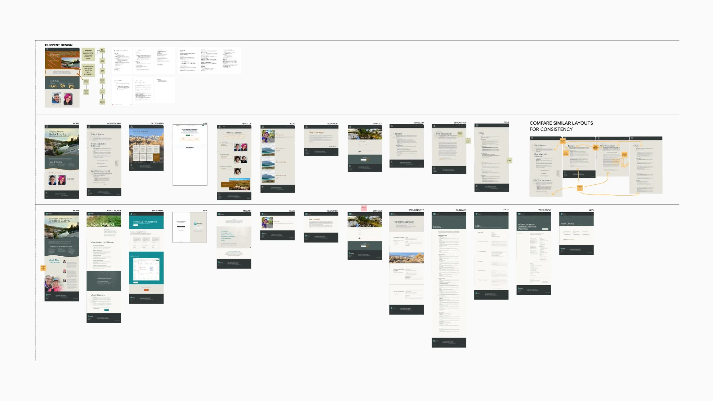
Site Design Overview

Social: Single Campaign & Pages, Additional Campaigns